How to read it
The module opens as a dashboard: period indicators with their variation, and six charts covering twelve months against the prior year.
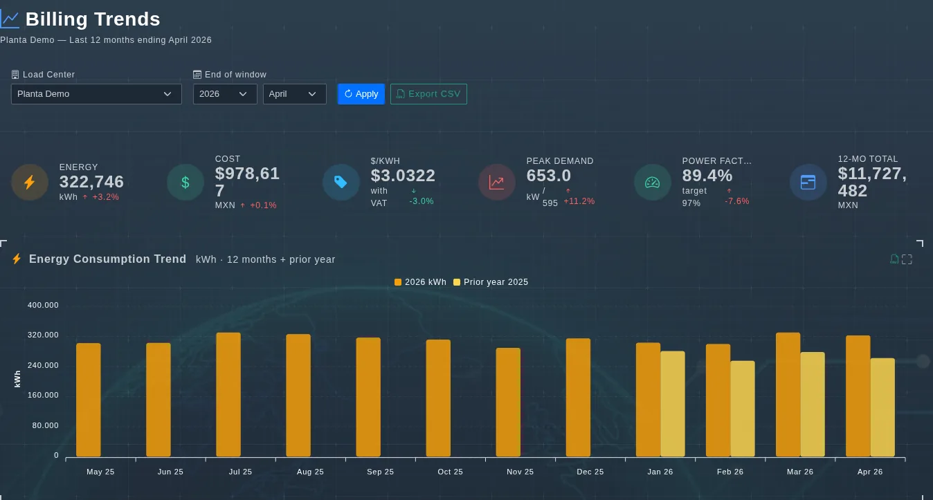
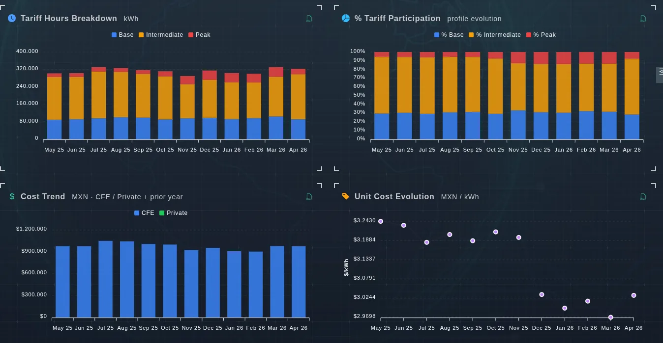
What each row holds
- Load center and end of window: what the period refers to.
- kWh and Δ kWh: consumption and its change.
- Cost and Δ cost: spend and its change.
- $/kWh and Δ $/kWh: unit price, the cleanest signal.
What it explains
- Separate whether spend rose because of volume or because of price.
- Spot the month power factor began to degrade.
- Project year end from the real trend rather than the average.
- Back next year's energy budget.